Zen Grid Framework v5 (zgf5) based themes have a number of options for adapting your website design to suit the device or screen size your visitor is viewing your site with. Responsive design is more than just making sure that the design doesn't break. It's about providing an optimum experience for your user regardless of the medium they are using to view your site with.

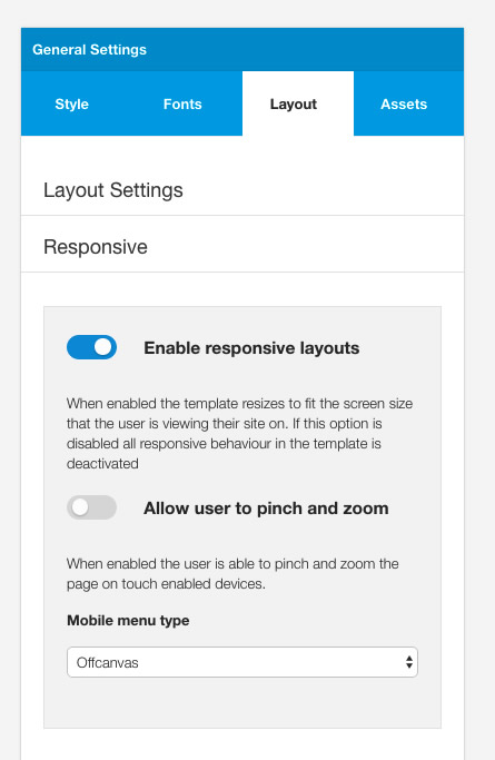
Firstly though if your project doesn't require a responsive design we have added the option to disable it with a single button. By disabling responsive layouts in the responsive settings panel it is possible to remove all responsive elements from the site - the theme will serve a desktop version regardless of the screen that the user is using to view the site.
Allow pinch and Zoom
Another option available in the template administrator is to enable the pinch and zoom feature for touch devices. Being able to change the scale of the presentation of the design can cause issues when the screen is rotated but if you want to your users ot be able to zoom into your content then it's super easy to add this.
Breakpoints
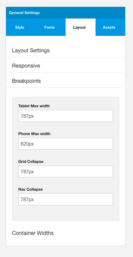
The breakpoint section is an important part of the responsive control and it sets the points in the browser where you can affect change to the design. The device names (tablet and phone) are really just guides as breakpoints should really be viewed literally as the point in which the design breaks, rather than as a way to target a specific device eg ipad3, iphone 6 etc.

The max-widths specified for phone and tablets link into the phone and tablet icons in the layout tool. That is, if you want to hide a row at the tablet width, you would do this by clicking on the tablet icon for that specific row in the layout tool. The actual pixel width that that row is subsequently hidden is determined by the value set in the tablet max width value above. You can easily adjust the width that the row is hidden by adjusting the value and then recompiling your less to css.
The grid and nav collapse values refer to the points at which the grid layout and the main navigation collapse. Setting these options to 0 will effectively mean that they never collapse and setting them to an extraordinarily high number - say 100000px - will mean that the grids and navigation always remain in their collapsed state.
Responsive Classes
The values set in the breakpoint section also determine the widths that the following responsive classes apply to your design. These responsive classes are specified in the zen/libs/zen/less/_responsive.less file.
- .hidden-desktop
- .visible-desktop
- .visible-tablets
- .hidden-tablets
- .stack-tablets
- .stack-phones
- .hidden-phones
- .visible-phone
- .visible-navcollapse
- .hidden-navcollapse
- .visible-gridcollapse
- .hidden-gridcollapse
These classes are available to use in your content items, module classes or in any custom template layout you create.
Collapsed Menu Behaviour
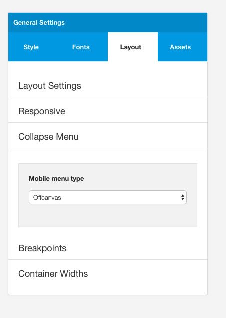
There are 5 options available for determining how your menu behaves when it is below the nav collapse value.

Those options are:
- toggle menu
- off canvas menu
- select menu
- stacked
- no change
Multi-level menus for toggle and offcanvas menu types are automatically transformed into accordion menus to make long and complex menus more usable for small screens.
Mobile Detect
A related option in the Zen Grid Framework 4 themes is the ability to use a server side script to target phone or tablet devices. This setting can be found in the settings > mobile detect area of the template settings.
This option uses a light weight PHP implementation for detecting your visitors device. The Mobile Detect library as implemented in zgf5 themes specifically target devices that are tablet, phones or desktops.
The layout tool settings for hide or stack on phones or tablets triggers uses the mobile detect settings if this option is enabled. This means that breakpoints settings are ignored on those devices and if a device tests as a tablet, for instance, then it inherits the settings for tablets set in the tool, regardless of whether the device is held in landscape or portrait mode.
The benefit to using the mobile detect library is that it can significantly reduce the load time for tablet and phone devices.


Icon Example 4
This module uses the zen-icon zen-icon-comments bottom large secondary1 module class.